For years I’ve been the resident Excel guru who knows how to run a pivot table and not stuff up a vlookup.
This 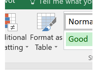 year I thought I would take my meagre skills and try and super charge them by adding buzz words like analysing and visualization. And now I’m a data scientist and paid a million dollars a year! So I’m still no data scientist but I have learnt some nifty Excel tips and tricks and heap of things that I didn’t know were possible.
Format As Table
What does this do?
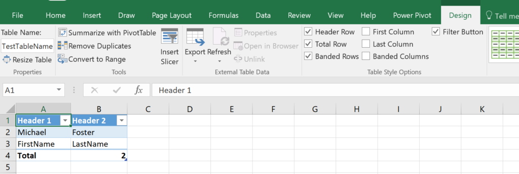
- Gives you a new tab: Table Tools / Design tab
- Adds Automatic filters
And then we get a whole heap of features
- Table Name
- Quick pivot table
- Remove duplicates
- Convert to range (Revert from your table back to data)
- Insert slicer
Slicers
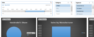 As far as visualising excel graphs I didn’t have the concept of slicers previously. I’d always applied filters on my pivot charts or pivot tables. Slicers is definitely a more visual representation and I love the timeline slicer. The ability to select by days, months, quarters and years is useful.
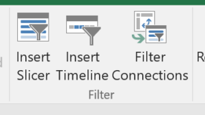
And the final useful feature is to be able to associate a single slicer with multiple charts.
Flash Fill Text
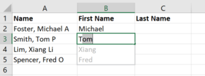 I’ve always loved Text to Columns feature but sometimes it’s a bit time consuming. The Flash Fill feature though is so quick and visual. Start typing on the second entry and it starts making a guess for you. Cool. Press enter and it completes the rest of the column for you.
Not perfect but for common formats it can save you lots of time.
Data Model / Power Pivot
So was there any real point to adding our data as tables? Yes!
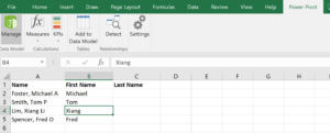 Once they are added as tables we unlock to Power Pivot tab and we’ve automatically added our data as a table. With this we get a whole new interface to play with data. Sometimes you have to Add to Data Model to get your table in. I’m still not sure on the rules for when it’s added or not. Once added you can see the data as tables within your model.
So what is this? Just another Excel window?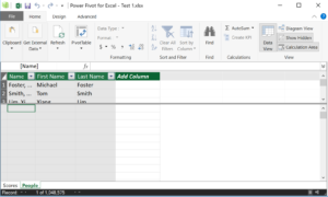
Well kinda but we’re getting much closer to a database than we are in Excel now. And we get a whole other language to start creating new columns. And… we get a new term called measures which allow us to have calculations across the whole table. These are cool because we can use them in our pivot tables later.
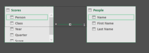 Let’s look at a very database feature first by looking at the diagram view. Relationships!
One of the tables needs to be unique and after that we can just drag from one value to create a relationship between them. Cool stuff!
![]() So now let’s do the equivalent of a VLOOKUP. In DAX (the language of Power Pivot) it’s called LOOKUPVALUE and we could do something like =LOOKUPVALUE(People[Zone],People[Name],Scores[Person])
So now let’s do the equivalent of a VLOOKUP. In DAX (the language of Power Pivot) it’s called LOOKUPVALUE and we could do something like =LOOKUPVALUE(People[Zone],People[Name],Scores[Person])
It’s so neat and tidy. No need to refer to the size of the table and worry about it changing. The parameters are:
People[Zone] – the columns you want to return
People[Name] – the column we are searching on
Scores[Person] – the value we want to search for. It just assumes that the current rows value is the value we are looking for which makes sense.
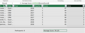 And we can also do calculations for a whole column. Let’s get the average scores. The format for typing this one in is a little different than normal.
Name of Measure:=
And we have a section below our table to track them.
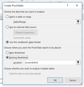 When we create a pivot table now we can use our Data Model rather than selecting a data range as we normally would.
And now my Data Model tables and fields start appearing in the PivotTable Fields list. Nice!
On top of that we have the measures that we created.
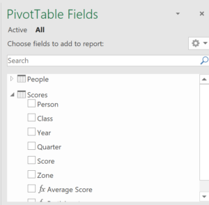
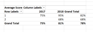 And the cool thing about the measures is that they are responsive to the rest of the design of our pivot table. My average score here recalculates for the year and zone as required.
It’s possible to stop this behaviour too which is something you need to keep in mind if you are calculating totals that needs to stay fixed. For example if I want to calculate the total sales and I’m going to use it in a formula then I can’t really have it changing.
Date / Calendar Table
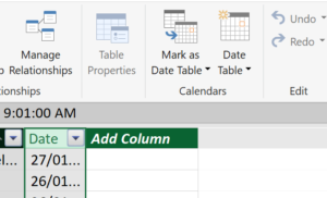 There’s one other thing that I think is important and it helps with the timeline slicers that we saw earlier. For this one I’m adding a new table of login information for each class. To Give myself a unique value to compare the tables I’m creating an extra column of Name and Class concatenated so that we can reference them.
Then we can go to Date Table > New to create our Calendar table.
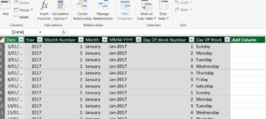 It’s smart enough to look through our existing tables and pull out all the dates and gives us something that’s going to be awesome for our slicers and filtering.
 One thing that it doesn’t do is link up the relationships. I’m going to do that now.
Our humble set of tables has certainly taken on a life of its own!
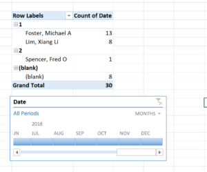 And now we can add in our timeline slicer
There’s a few other cool things we can do with the data. The best one is to create hierarchies based on the data we have. If we have nicely formatted data we can get it to create the hierarchies. The most common example being country, state, city, street type information.
Data Queries / Query Editor
So the other big part of the course is around getting data into Excel and here I learnt a couple of nifty things.
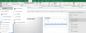 I’ve previously connected up data files and imported data but the professional version offers a lot more functionality. The big one for me – the ability to pull data from salesforce. I’ve been manually extracting data from reports and adding it to Excel so I’m really excited about this feature and let’s see if I can highlight a few things.
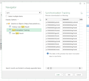 No changes to where we find the goodness – the data tab has everything we need. From Get Data I now get a load of options. Most of my time has been spent pulling data from text fields so it was really cool to have some other sources. Here I’m going to use the “From Online Services” and “Salesforce Objects”. I’ve skipped the login step but once I’m in I get a list of the objects and can get a preview of the data.
The Salesforce Objects seems to be a better approach as the reports are limited to only 1000 rows. Once we have the data we’re going to Edit the query as there’s lots of things I can do there.
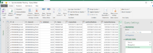 The best part about the Query Editor is that there’s often steps that we do every time. Here’s I’ve removed a couple of columns of data that I didn’t need. I could also change some of the values or do corrections or clean ups here and the steps will be automatically repeated every time. That can save you a lot of time and potential errors. At the moment I run a manual process every month and I’m hoping this will remove all the manual steps.
Once I’m done with the fix up I can load it into my data model.
So that’s it. There’s always more to learn and I’m glad I’ve uncovered some new features that can make me work more productively. It’s definitely helping with my job and I’m looking forward to applying what I’ve learnt and getting deeper into these features.

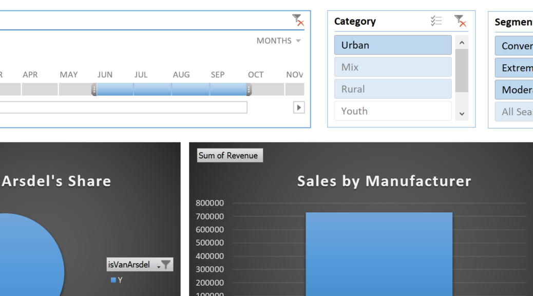
The slicer tool is useful, I’d never noticed it before thanks for drawing my attention to it.