This article compares the infant nutrition price – the price of infant formula from my local supermarket. I compare the different companies, if there’s a relationship between the shelf level and price and if there are further relationships between the number of products being promoted or the number of marketing messages.
This is the final post of four and gets to the heart of the concern – cost.
The first post, Nutrition (Infant, Dairy, Maternal and Adult) : Singapore Analysis, talked about the industry and introduced the major players. I also analysed a single shelf to see how the companies were arranged. We’ll come back to this shelf space allocation to see if there is a relationship with the price.
The second post, Nutritional Ingredients in Infant Formula, discussed the products that companies are marketing and where companies focus. Again, we’ll come back to that analysis and look at the relationship to price.
The third post, Infant Nutrition Marketing Messages, analysed the marketing messages beyond the product to see how brands were trying to influence the consumer. Is there a relationship with the price? Read on to find out.
Method
As per the previous posts, I’ve looked at a single shelf in a FairPrice supermarket in Bishan, Singapore. The shelf is ideal as it’s prominent, spacious and on a clear exit from the store. The data was captured in 2019 and recorded in a public Google Sheet.
One of the keys to this analysis is how I’ve calculated the price. The price on the tin isn’t the most useful here as there’s a large range of sizes and free items. To give a fair comparison I’ve divided the price by the total size of the product including any free product.
Company Comparison
The comparison showed clearly why governments are worried about the price of infant nutrition. With the Nutricia and Abbott brands being more double the average price of the home brand FairPrice product.

Brands didn’t tend to vary too much on their pricing with their cheapest products correlating fairly well with the highest, average and median.
I was expecting Abbott and Reckitt Benckiser to be near the top so it was surprising to me to see Nutricia right up there.
For companies that had more than one brand, it was not surprising to see that one was price higher and the other lower. For Danone, it was about taking the most expensive and middle of the table. With a different strategy, Nestle was priced in the middle of the table and one of the lowest big brand products.
FairPrice not surprisingly focused on being the home brand product and the most economical.
Infant Nutrition Price vs Shelf Level
Looking back at my first post in this series I spent time analysing which products were located on the best shelves. I termed these “Priority”, “Border” and “Searching”. Priority shelves were easy to see and reach. Border were the neighbouring shelves. And Searching shelves required serious bending to be able to locate the products.
So did the prices per shelf match my analysis? Yes and no.
For the most part, shelves got more expensive the higher you were placed. The exception being my priority shelf on the 6th row which had both Australia’s Own and FairPrice product taking up 60-70% of the space.

Taking out FairPrice from the analysis gave us a pretty clear view that the top four shelves are key for price. I was surprised that the top shelf was such an outlier as far as price.

Could anything else be going on here? Yes, the largest containers were typically at the bottom and the smallest at the top. Scale matters.
Shelf, Unit Price, Package Size, Company Comparison
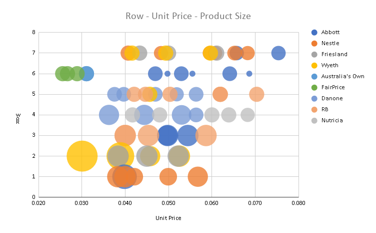
The following plot shows that the largest containers (represented by the size of the circle) were found on the lowest two shelves. Package sizes got progressively smaller as we move up the shelves. Buying in bulk can certainly save you money.

While each shelf had a spread of unit prices we can see the trend towards higher prices as we move up the shelves. The outliers on shelf six with FairPrice and Australia’s Own are clearly visible. One final highlight is the bulk buying value of a single Wyeth product on shelf two.
Infant Nutrition Price vs Product Marketing
It’s also interesting to compare the number of products that are marketed on the package against the price. There’s less of a trend here with most products having a similar number of products marketed. Dumex was the clear outlier and yet it was at mid-table. On the flip side, Friesland with no products mentioned on the package was only one place lower.

Infant Nutrition Price vs Marketing Messages
The final comparison was against the marketing claims on the package of each brand. There’s a small trend here with Abbott and Reckitt Benckiser, the top two self-promoters, filling spots two and three on price.
Beyond that, the results are mixed. FairPrice still takes up the bottom place but NAN and Friesland appear mid-table with similar numbers of categories marketed.

To summarise, the shelf location seemed to align closely with the price. There are massive prices differences between branded products and the home brand. Buying in bulk is certainly cost-effective and for practical reasons, they are also likely to be on the lower shelves. There was a weak alignment between the marketing claims and the cost.
There’s a lot more to cover in the world of infant nutrition marketing but I hope you’ve enjoyed the series!

One thought on “Infant Nutrition Price Analysis – Are You Paying Too Much?”